Okcoin Mobile App
Concepts & Improvements
Portfolio Data Visualization Concept

The portfolio dashboard is one of the primary districts in the Okcoin app. It provides insights into a user’s crypto performance over time for assets they are holding as well as assets staked in any earn cycles. Users are able to navigate to their portfolio from both the bottom navigation as well as from a hi-emphasis card on the app’s main dashboard.
One of my biggest pain points while using the app has been the way the asset information is presented in the portfolio. The data visualization is broken down into percentage values that offer little value in understanding the holdings in my portfolio. The asset list items and the donut chart have no clear connection and seeing both in the same view make it hard to understand my performance at a quick glance.
Based on my frustrations while viewing my portfolio, I started to iterate through some ideas of breaking the list and data visualization into separate views in hopes of reducing clutter and improving the hierarchy of the content.
For the visual, I wanted to try categorizing a user’s holdings into categories rather than percentages. My thought was that categorizing holdings would help users begin to form mental models around the assets and find a purpose for their crypto beyond just holding or staking it.
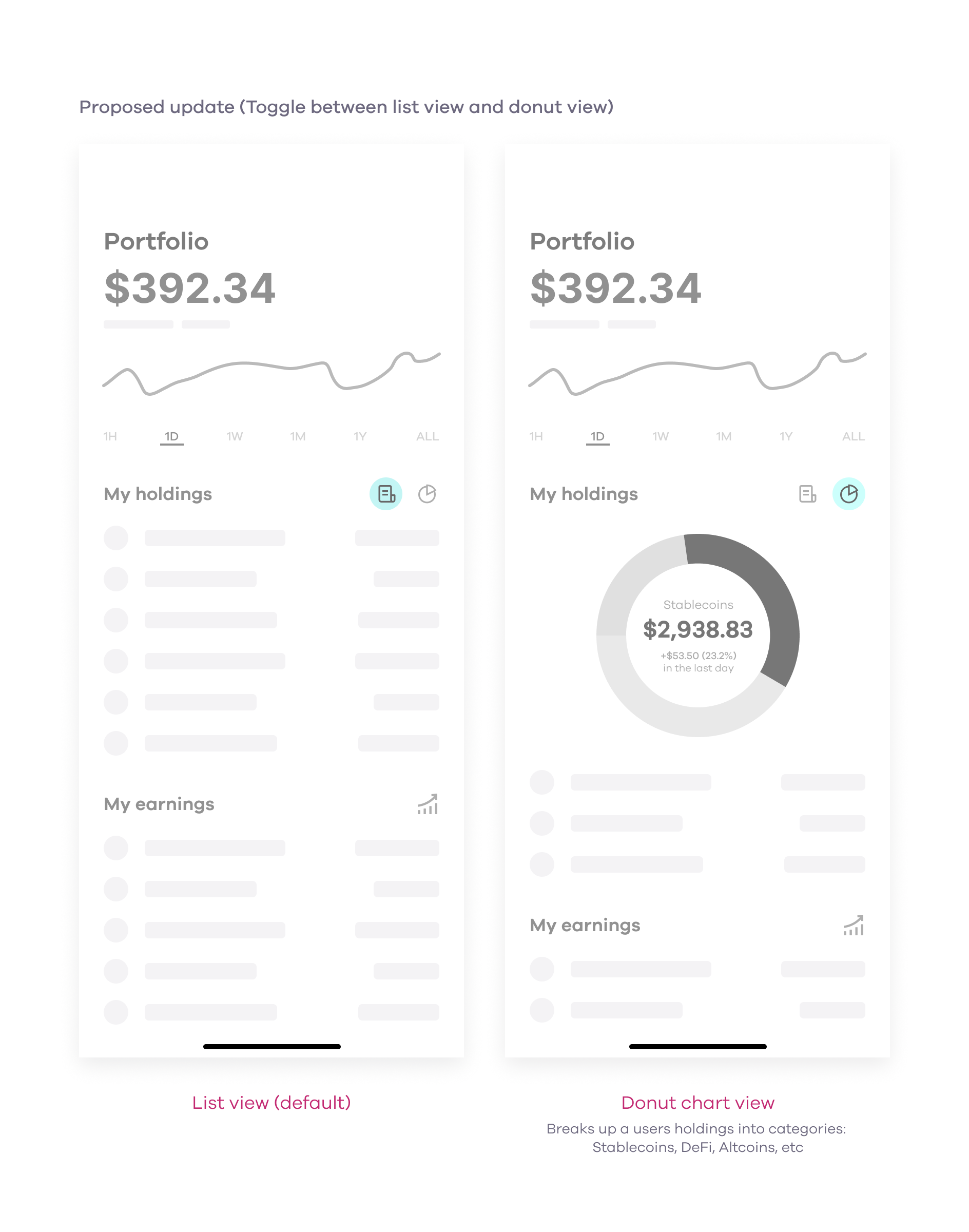
As I moved into a hi-fi solution for the design, I went through the 70+ assets available on the exchange to start categorizing them. If given more time, I would have surfaced additional education on the categories themselves. When it came to the UI, I decided to surface the categories in selectable chips that allowed the feature to scale for future categorization.
The final design was included in the initial launch of the Okcoin dribbble.

My Earnings Update

”My earnings” is a high-emphasis card present on the app’s main dashboard that allows users to see their earnings from any assets staked on the platform. Our customer support team had been getting consistent feedback that the card was being overlooked by our customers. This same feedback was received by new employees at Okcoin who had added assets and did not know where to go to see their earnings.
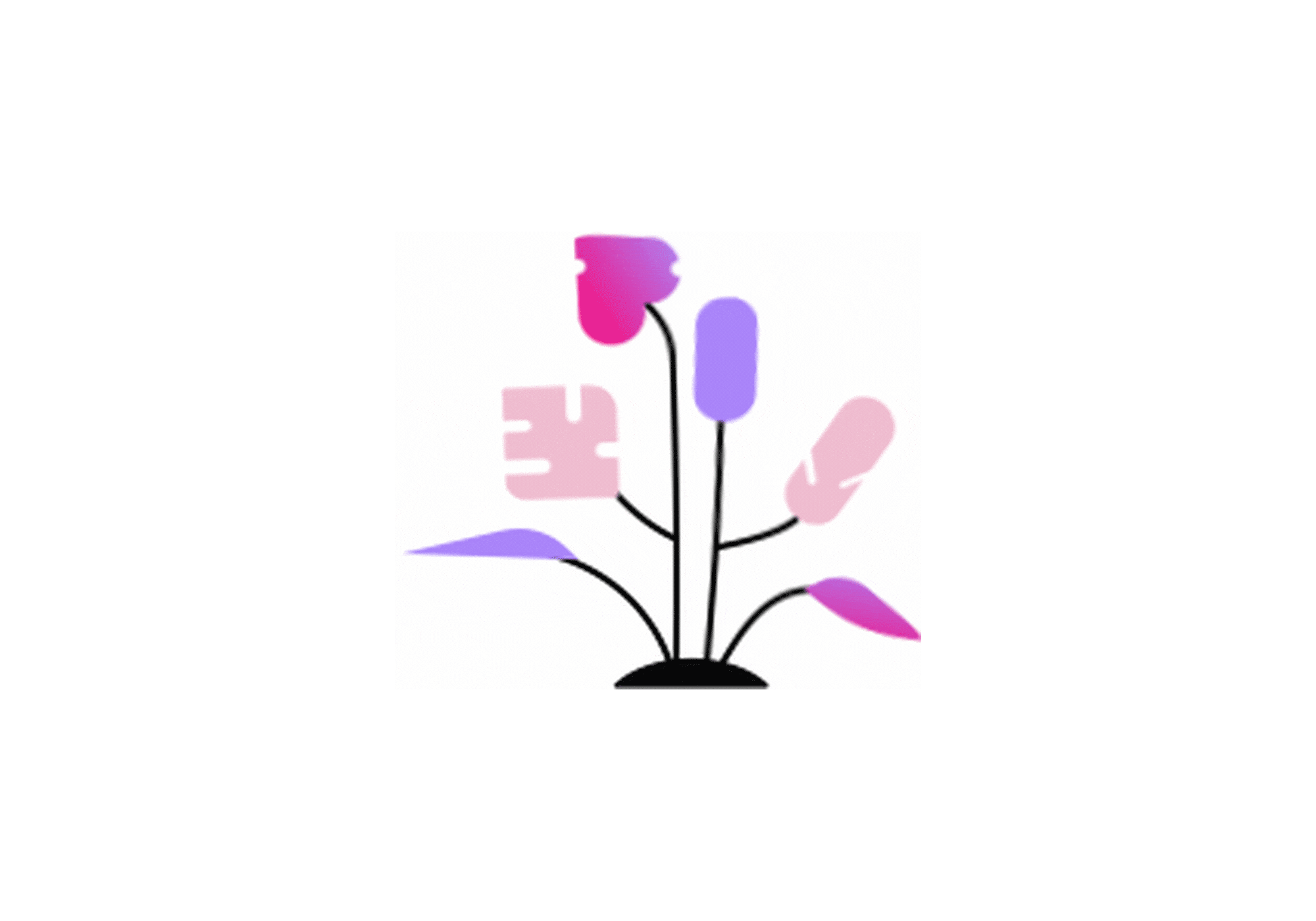
As I began to iterate through design options, I was unable to find an illustration from our library that could be repurposed for this card. I collaborated with an illustrator from the marketing team to develop a new illustration specific to Earn that could be used here and in other areas of our app. At the same time, I looped in another product designer with a background in motion graphics so he could begin to explore options to animate the illustration.

It was easy to see why so many of our users were overlooking this card as it had almost no visual affordance compared to the rest of the cards on the dashboard. The title was also the same as a bottom navigation item that took the user to our available Earn offers.
I set out to align the hierarchy with the Portfolio card that was displayed above. To add more visual affordance, I also wanted to include an illustration for the card so users would know it was a tappable surface.

Several animation options were explored including choreographing the animation with the line graph in the portfolio, and a close transition if a user tapped on the card.

After presenting multiple animation options to the experience team during a critique, we landed on a loop animation for the illustration. With no other elements on the dashboard having any animations, the team liked how the loop animation was subtle enough to notice without being too busy to detract from the other cards or actions. The illustration was optimized in Lottie and handed off to native engineering teams as a JSON file so the animation could scale in size to any mobile device.